It started with a simple question that kept nagging at me while living in Cottbus, Brandenburg:
As someone watching the Energiewende unfold right in my region, new solar parks sprouting on former coal fields, wind turbines dotting the landscape. I wanted to see the big picture. The data already existed. In fact, all of it existed meticulously collected and published by the German Federal Network Agency in the Marktstammdatenregister (MaStR).
Millions of records describing power plants, storage systems, wind turbines, solar installations, operators, capacities, and locations.
But there was a problem.
The data was dense, fragmented, and difficult to explore intuitively. CSV files, XML dumps, database exports - excellent for compliance, terrible for insight.
That gap is where MaStr_Visualizer was born.
This post tells the story behind the project - the motivation, the architecture, the technical decisions, and the challenges that turned raw registry data into something you can actually see and interact with.
The Problem: Data Without Perspective#
MaStR is comprehensive, but answering even simple questions is hard:
- Where are wind installations actually concentrated?
- How fast is solar capacity growing, and where?
- Which technologies dominate specific federal states?
- How does infrastructure evolve spatially over time?
Tables alone don’t answer these questions.
You need maps.
You need filters.
You need speed at scale.
The Vision#
MaStr_Visualizer was built around three core goals:
- Ingest large-scale official energy data
- Serve it efficiently through a clean API
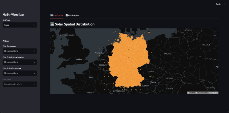
- Render it interactively on a map - without sacrificing performance
This isn’t a static dashboard. It’s a system designed to scale, extend, and remain responsive even with millions of geospatial records.
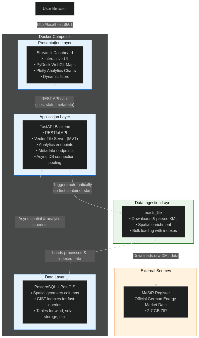
High-Level Architecture#
Why These Tech Choices?#
- PostGIS: Energy data is spatial by nature - GIST indexes and native vector tile support make bounding-box queries blazing fast.
- FastAPI: Async-first, automatic OpenAPI docs, and excellent performance for serving tiles and stats.
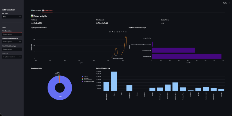
- Streamlit + PyDeck: Rapid prototyping with production-grade WebGL map rendering capable of handling millions of points smoothly.
- mastr_lite: Battle-tested library for parsing the official MaStR dumps.
With this stack, the map renders millions of points interactively even on modest hardware - no lag when panning or zooming across Germany.
Data Layer: Treating Geography as a First-Class Citizen#
Energy infrastructure is inherently spatial. PostGIS provides:
- Spatial indexing (GIST)
- Geometry-aware queries
- Fast bounding-box filtering
- Native vector tile (MVT) support
Backend: FastAPI as the System Core#
FastAPI was chosen for async performance and clean API design.
Key endpoints include:
/api/tiles/{unit_type}/{z}/{x}/{y}      # Vector tiles for the map
/api/stats/advanced/{unit_type}        # Aggregated analytics
/api/metadata/{unit_type}              # Filters and options
Example tile endpoint snippet:
@app.get("/api/tiles/{unit_type}/{z}/{x}/{y}")
async def get_tiles(unit_type: str, z: int, x: int, y: int):
    bbox = tile_extent(z, x, y)
    query = f"""
        SELECT ST_AsMVT(q, '{unit_type}', 4096, 'geom')
        FROM (
            SELECT id, capacity, ST_AsMVTGeom(geom, TileBBox({z}, {x}, {y})) AS geom
            FROM {unit_type} WHERE geom && TileBBox({z}, {x}, {y})
        ) q
    """
    # async execution...
Frontend: Streamlit, Used Intentionally#
Streamlit + PyDeck enables:
- WebGL rendering for millions of points
- Smooth interaction and dynamic filtering
- Rapid iteration on analytics charts (Plotly)
Challenges & Lessons Learned#
- Ingestion time: The initial ~2.7 GB XML parse and load takes 30–60 minutes. Lesson: Made it optional/manual and added progress logging.
- Geocoding quirks: MaStR addresses aren’t always clean - relied heavily on open-mastr’s enrichment.
- Streamlit scaling: Great for prototyping, but heavy sessions need careful caching and async handling.
These hurdles taught me a lot about working with real-world open government data.
Deployment#
docker-compose up --build
The app runs locally at http://localhost:8501. Data persists in Docker volumes.
Closing Thoughts#
MaStr_Visualizer bridges the gap between raw registry data and real understanding. Sometimes, making data visible is all it takes to spark new questions - and maybe even better decisions during Germany’s energy transition.
If you’re exploring the Energiewende, working with energy data, or just curious - try it out yourself! Feedback, issues, and contributions are very welcome.
🌟 Star the repo if you found this useful!